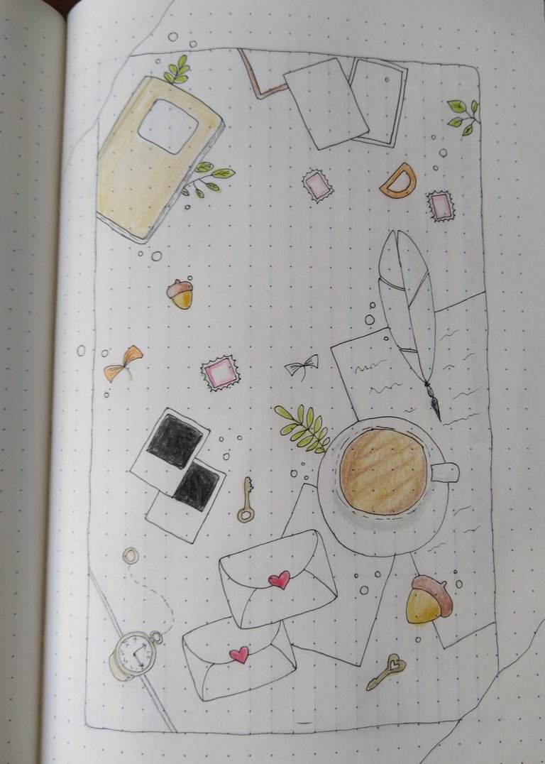
For this month, when I searched for inspiration online, I found many similar main pages, or themes, which were mushrooms. I really liked the idea, and almost went with it, but then I saw another one, a different, which was more fitting for me, and for my month of September. Now sure how to call the theme of this one, but maybe mix of desk and things on it, and fall vibes. Well, you will see the photos so you can decide for yourself.
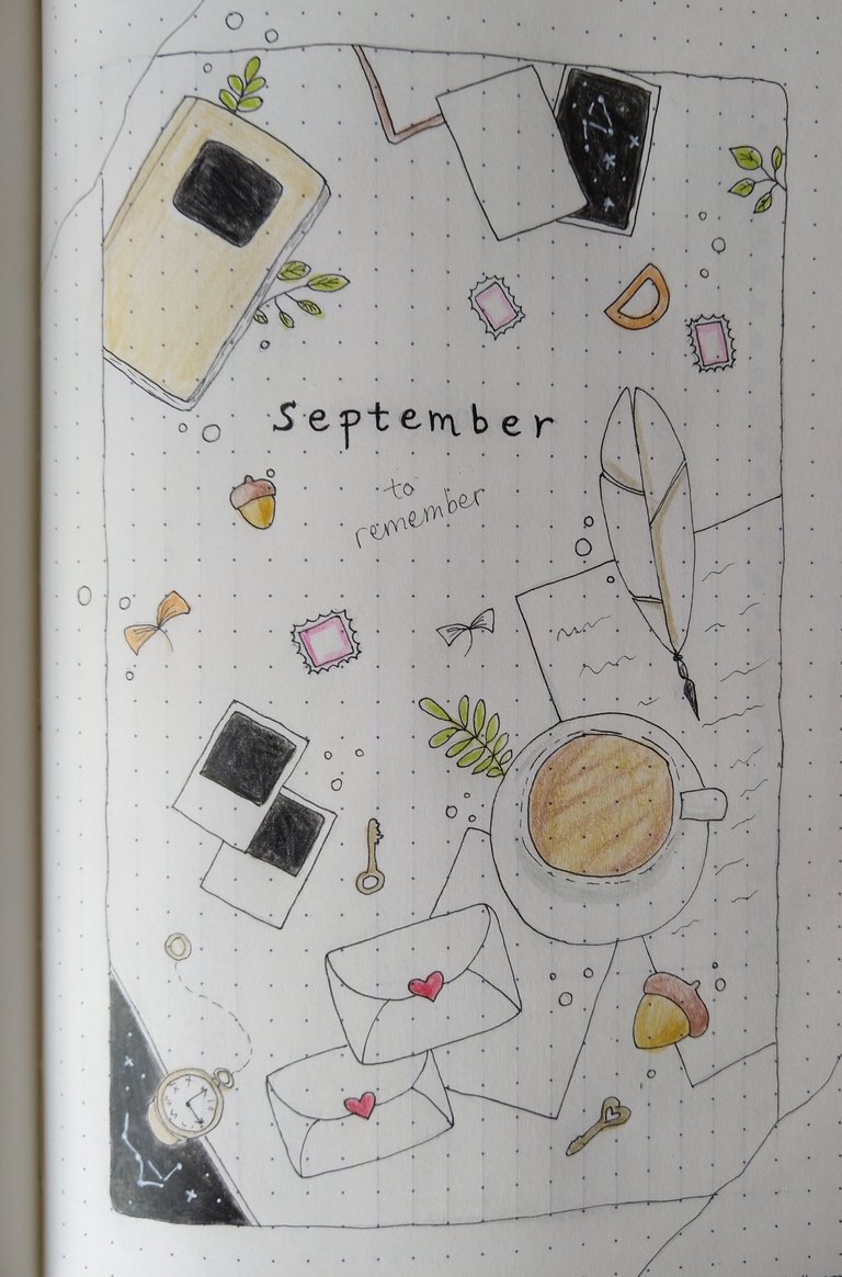
As per usual, I didn't want to spend much time on it, but also I didn't want to make it too simple this time, and plane. But what I have learned is, no matter how much time you plan to spend on it, you will definitely spend more. It happens to me every single time. Nonetheless, I enjoyed making it, and I am happy with the result, but it's just a side note.
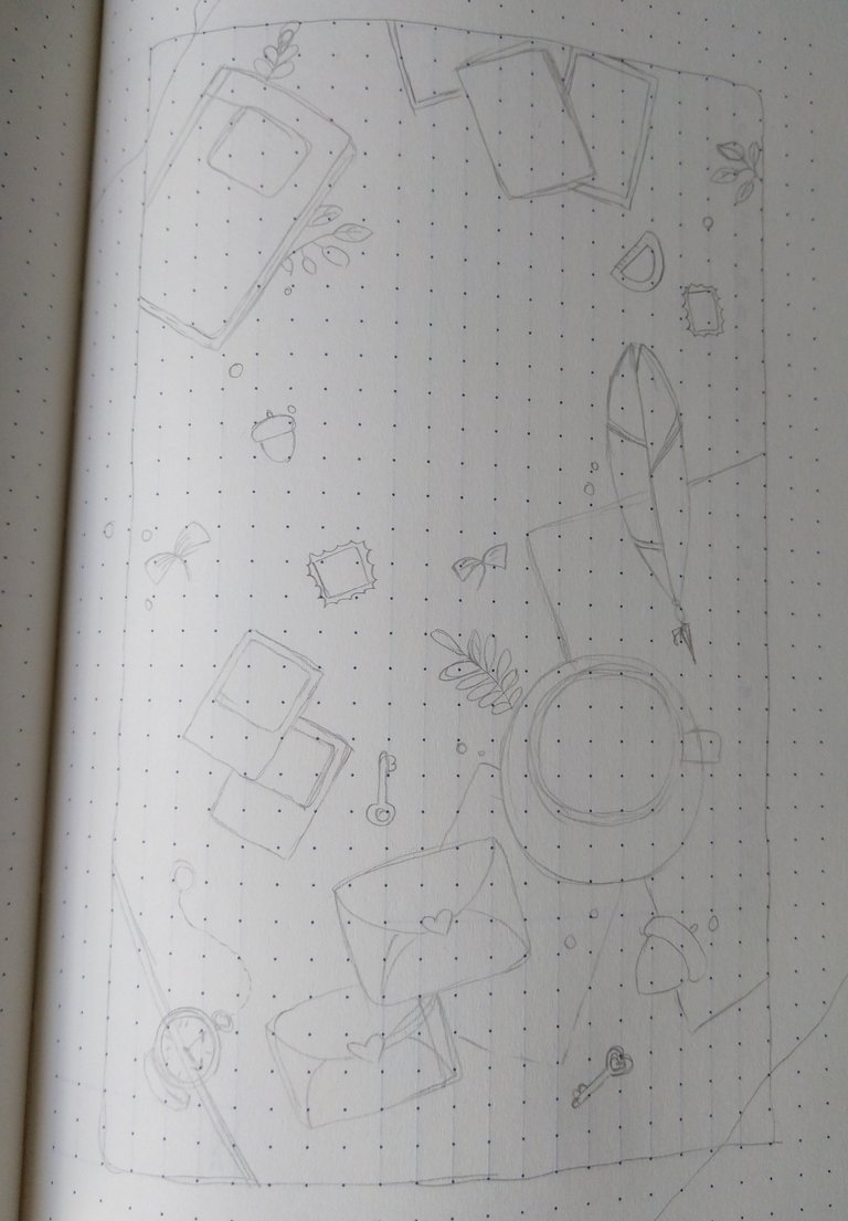
In case you want to check out the video that was my inspiration, here is the link. Of course, I didn't make it exactly the same as in the video, just because I didn't measure anything and did the same proportion as she did. As you can notice things are not in real proportion, but I don't have a problem with it in general, and specially with drawings like this, it's not that important at all. Besides, not placing some things and drawing everything as she did, I also didn't have any washi tapes or other stickers or anything like that to add. I can say they are not so popular and common here, which is maybe for the best, in my case, because I feel like I would buy them all the time and have way too many, and also spend much more time on making things like this. Anyway, I left out the place where she taped the pattern, and I meant to just color it and add black lines, but in the end, I just left it as it is. I will share photos of the process of making it. First I do pencil sketch.
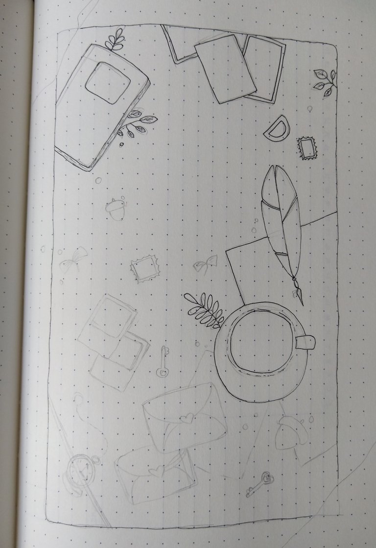
Then I do black pen, and this time I did all (except word September) with 0.03 pen, oddly, it seemed too thick for me, for some reason.
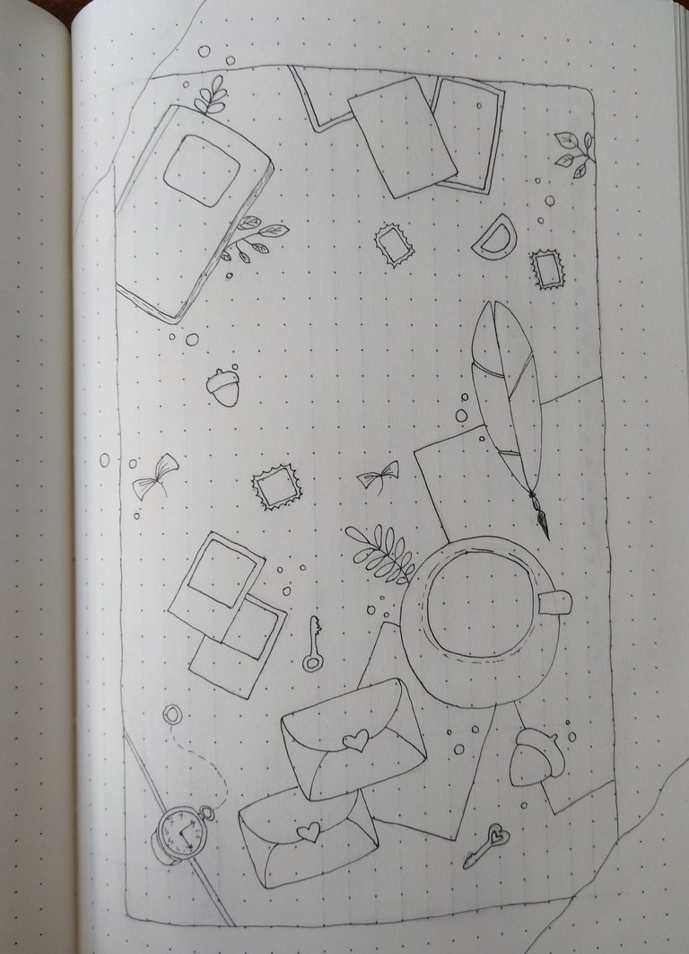
And then coloring. I didn't have as many brown shades as she did, nor the same shades, but I tried to do best with what I had. Also, black parts I did with black color pencil instead of pen, because my paper is not that good, and it would be visible on the next page. But I was happy that my white pen did well on black color pencil and those part didn't blend or got bad. Only thing I wish to be different, is the green parts. Maybe I could have added more of them, which would make page more fresh. And also that pink was maybe to aggressive for the rest of the colors, but oh well.

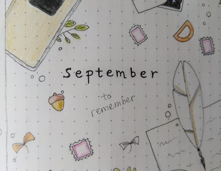
And the last change I made, was adding that "to remember" part. As I already mentioned, September is not my favorite month, but I want to try my best to make it a good one this time. I know it will be hard, but have to stay positive and do my best.
Other pages that I won't show this time, are my habit tracker which I changed this month, after so much time. Expense tracker is also there, as well as regular pages with to do tasks. And another different page this month is "dump" page, where I will just add and write whatever I need or feel to write. Such as mentioning some good movie I watched or book I read (since I know there won't be many of those this month for a separate section), or some good new song I hear, maybe a site to remember later on, or something like that. You get the idea.
That would be all, I guess. Hope you liked my post and maybe got inspired to do something similar for your bullet journal next month. Next month I am excited about for bullet journal, and it should be different, but you will see that in a month, or hopefully, less time.
As always, thank you for stopping by and reading my post, and sorry for my inactivity here, and not visiting you as much as before. I will try to fix it.


