It was evening when I heard my phone singing, and I was humming along to Jim Reeves' lovely rendition of the song "Best Friend." Sorry! There's a call, I quickly answered it. I heard a lovely voice echoing the name Fillz from the other end. With a smile on my face, I joyfully replied because I could detect from the voice that it was Amaka - the Vice President of History and International Relations department.

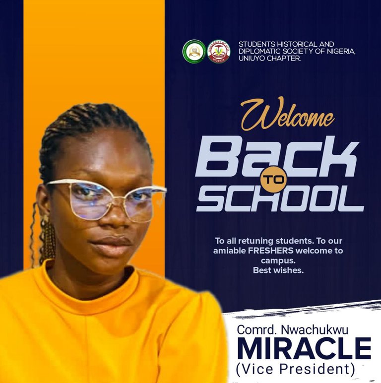
Final result
The phone conversation went like this:
Amaka: Hey, how are you doing? Me: Things are going well for me, and you Amaka: I'm doing well too. Me: I'm glad to hear that.
Amaka: I'm grateful. FillzMedia, could you help me out with a little work?
Me: Of course, I smile.
Amaka: I'd want a 'welcome to campus' flyer designed for myself.
Me: That's really awesome. I'm here to deliver at all times. Is that the entire article?
Amaka: Fillz, go ahead and complete your work; you know what to do and what I want. She grinned from the other end.
Me: That's okay, I get it. Think of it finished.
Amaka: I really appreciate it, Fillz. See you after you're through.
(The call has ended).
As soon as the chat finished, I looked through her collection to find the ideal photo for the design. I choose to use one of her great photos that I noticed of her wearing a yellow dress for the design/flyer.
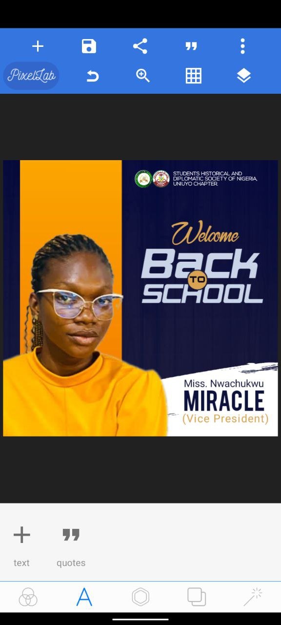
My app opened, and because I wasn't given a certain dimension to utilise, I chose my favourite. I maintained the same dimensions on all sides, including width and length.
I required a PNG image without a background, so I opened my browser, took the photo to an internet tool, and cropped it.
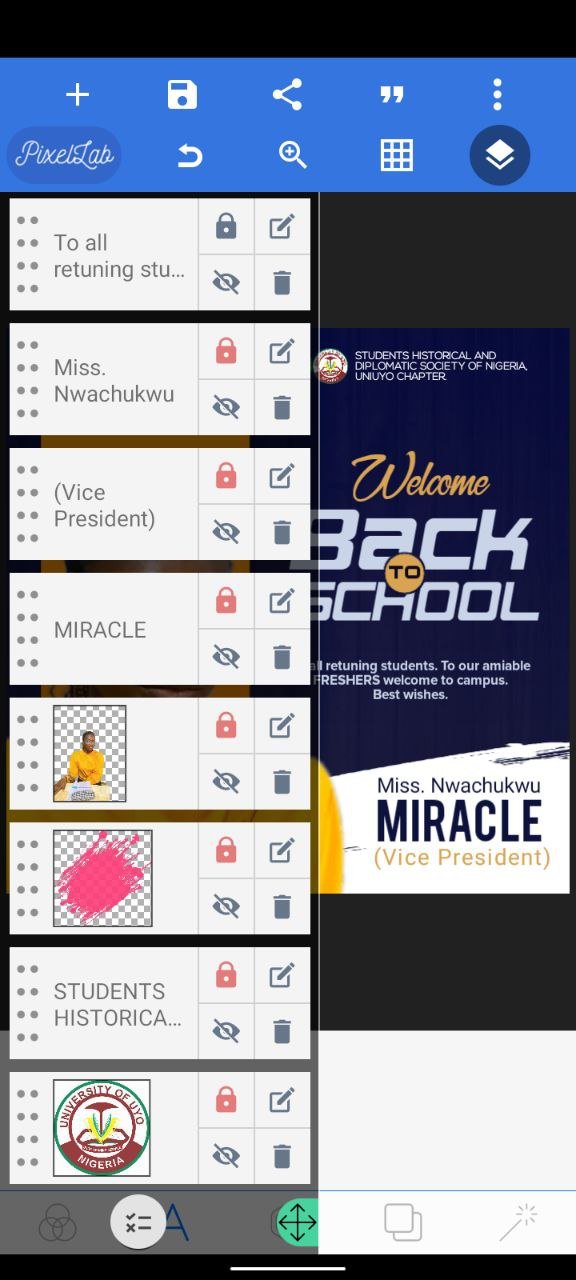
I reinserted it into Pixellab, the app I'll be using (and application for Mobile phone designing). I went into a local store and placed an order for a chilled Hollandia yoghurt because I was exhausted after the entire procedure. Upon finishing the yoghurt paired with a flavorful chicken, I turned around to face my work.
I opened my background folder, found a lovely background, and added it to the application. After trying to accomplish what I wanted with Amaka's image at the top left, I moved it to the bottom left, where it looked good and satisfied my eyes, so I left it there.

I included the faculty logo in addition to the school logo. I simply needed to import those two items into the workspace.

I began typing and experimented with fonts, colours, and alignment until I came upon the final design.
I was filled with excitement when I realised how wonderful and well-designed the design was.

Utilised app: Pixellab
Fonts used: BN%20Elements, Nova, and Nexa.
Duration: I didn't keep track of time (laughs)
Is there anything you feel I would have included to make it better than these?
Please feel free to send in your contributions/correction.
