
3 years ago in #logo by jacobtothe
$0.00
So cool! I love that you tied in actual real life photos.
I do like the fancier more curvy lines as far as font goes...not too fancy where it's hard to make out though.
Although the color won't matter for some of the things I use this for, I did want to keep the pink and grayish/silver theme. I liked the brown as well but would like it to be a little more bright (not so dark toned) if you know what I mean.
So all in all a pink, gray and white could be mixed around.
Noted. However, since you posted a silvery reflective crochet hook, I'm having some trouble isolating the hook from the background color. Perhaps if you took a picture of a less-reflective hook, I could switch it to grayscale after the fact to get more of a silvery effect? Meanwhile, I'll continue trying to learn new tricks in GIMP to work around that issue. Maybe I also need to abandon this idea and try something else first.
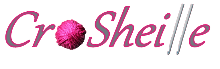
Ah that's so cool seeing my ball of yarn! 😆 It really does add a personalized touch to it. This is pretty nice!
I really like the outlined pink you did. Is there any way you can use script lettering? Also could you flip the hooks around so that they make an l like on the original design?
I currently only have shiny hooks. I could grab some wooden ones if you think that would be better to photograph.
If the crochet hooks I have here work for you, that's what I will continue to use with a quick flipperoo. If you have a particular font example, let me know. Otherwise, I'll browse the default Windows library and maybe check some reputable free font sites.
These three examples are apparently suitably licensed, for example, pending verification:
Okay that sounds good. I'm sure your hooks will work.
I love the Scriptina and I also like the Abuget one too.
Well, it looks like Scriptina is definitely from a creator-friendly foundry that is now perhaps defunct, so I'll see what I can put together once I'm done with the post I'm writing now. Would you object to a post about this process? I'll also link to your post here, and throw down the gauntlet to other designers from there, too! Any further revisions can take place there instead of extending this thread as well.
I don't object at all. A post would be a great idea to include any further revisions and communications. I’m excited to see what more you come up with. 😃
I really appreciate the time and effort you have put forth today to make my logo more personalized. That’s a big deal to me.
I think it's more fun to learn new stuff by doing something practical in the process. It's how I try to design my library craft programs, after all.
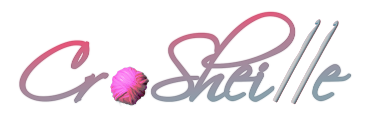
Well, this is more difficult than I anticipated. Here's a new iteration for you to critique before I figure out what keeps going wrong when I try to add outlines.
Hey @jacobtothe, I just wanted to touch bases with you and inform you that I now have the design that best fits my needs. However, I do want to thank you again for taking the time to try to create this logo for me. It was greatly appreciated. 😊
I definitely love that lettering! 👌🏽
Is there anyway the C and r could be spaced a little?
Also maybe try a solid black for the colors if the outline isn’t working. Or play around with other solids?
Oh and I probably shouldn’t have said flip the hooks around I should have said turn them the opposite direction. I meant turning them so they’d be in the same position as the photo I took…facing the right side. The hook would then act as the L. Hope I make sense.