what's up everyone. Hope everyone is well.
First of all, congratulations to all the winning artists in Splinterlands Art Contest Week 310. Moreover, the art of all the participating artists is beautiful.
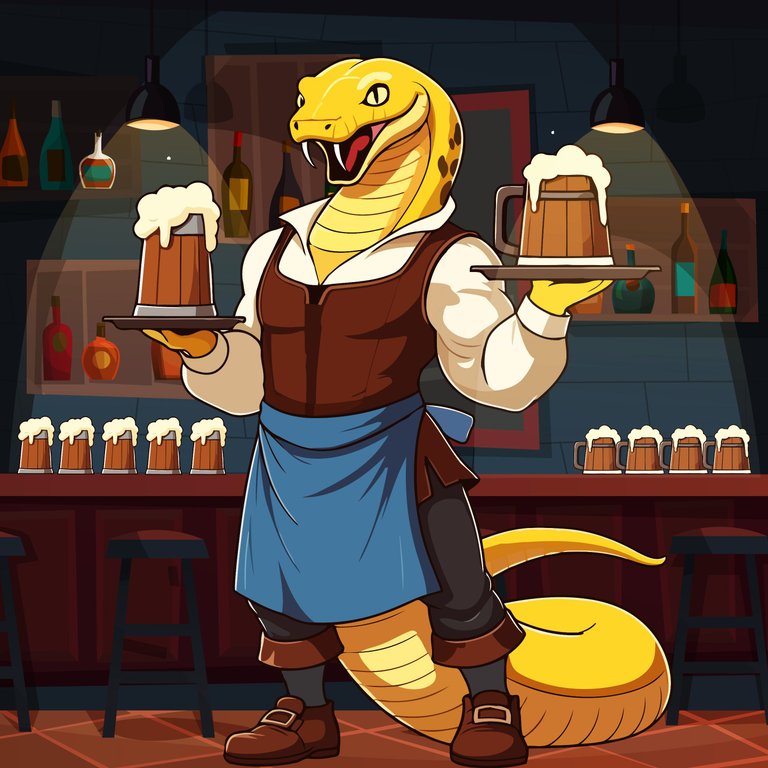
I am making this art for the Splinterlands Art Contest Week 311 art contest. Hopefully Splinterlands players know this. Yes, it's Sultry Barmaid. I made this fan art for Sultry Barmaid. Where he looks like a bar employee. Bit of a weird employee isn't it. 😂..now this is what seems accurate to me in keeping with the image on the original card so I drew it this way.
Let's talk about its drawing. So I drew it with Illustrator software. Which I always do. So first I made this sketch at primary level. So that I can understand. And this level can be called the main step of making an art.
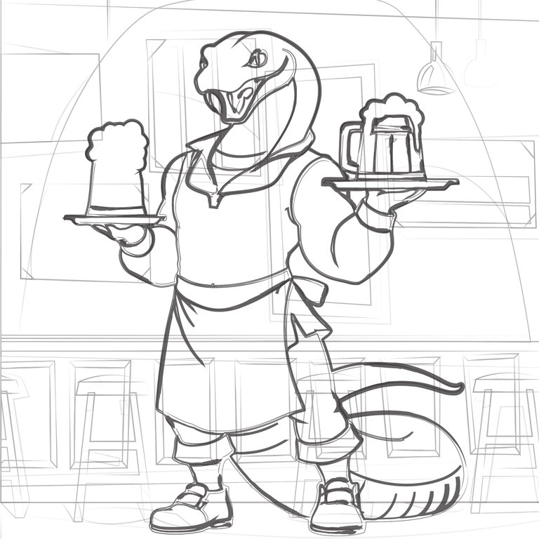
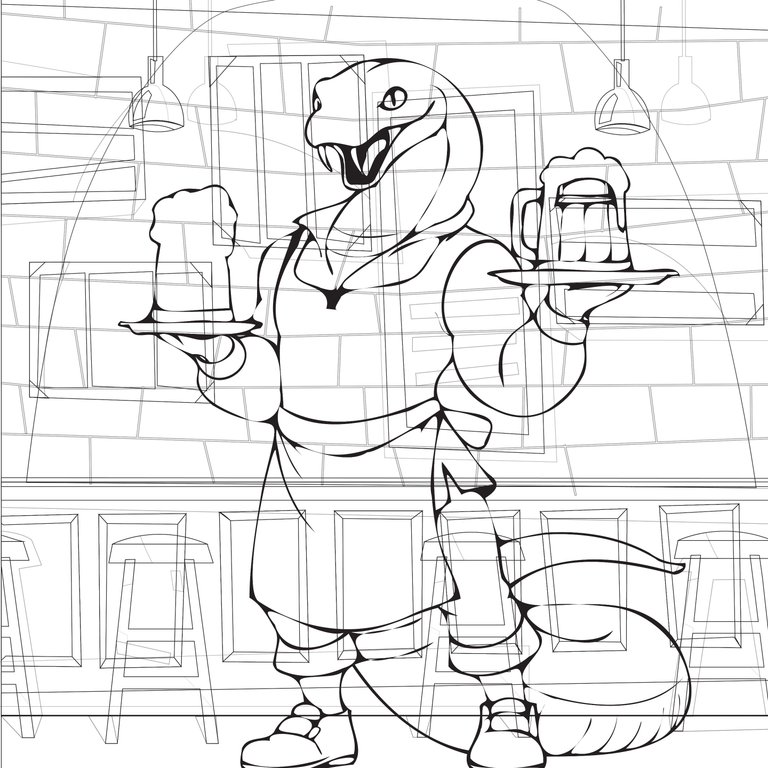
Then I added more lines because I felt the art was incomplete. Because a bar with few chairs and tables does not look good. So I tried to complete it by adding more. And it can be said that this is where I spend most of my time making art. Because here I have deleted many times. Because I wanted to add some human character behind it. But that didn't happen.
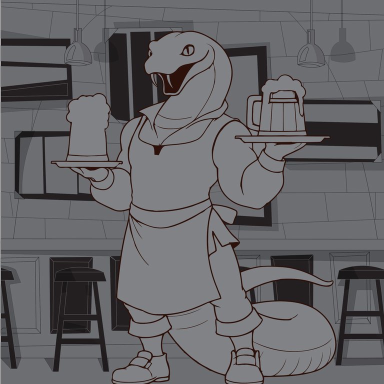
However, after that I started adding colors. I start with ash color first. This is my practice. I do this all the time. yes Not all of my posts may have pictures of this step. But I do it with all my art.
In the next step I first fill the character with the original yellow color. Next I started painting the back parts. Because the most colors have to be used there. One more time it has to be shaped. I decorated it with color bar black and brown ink.
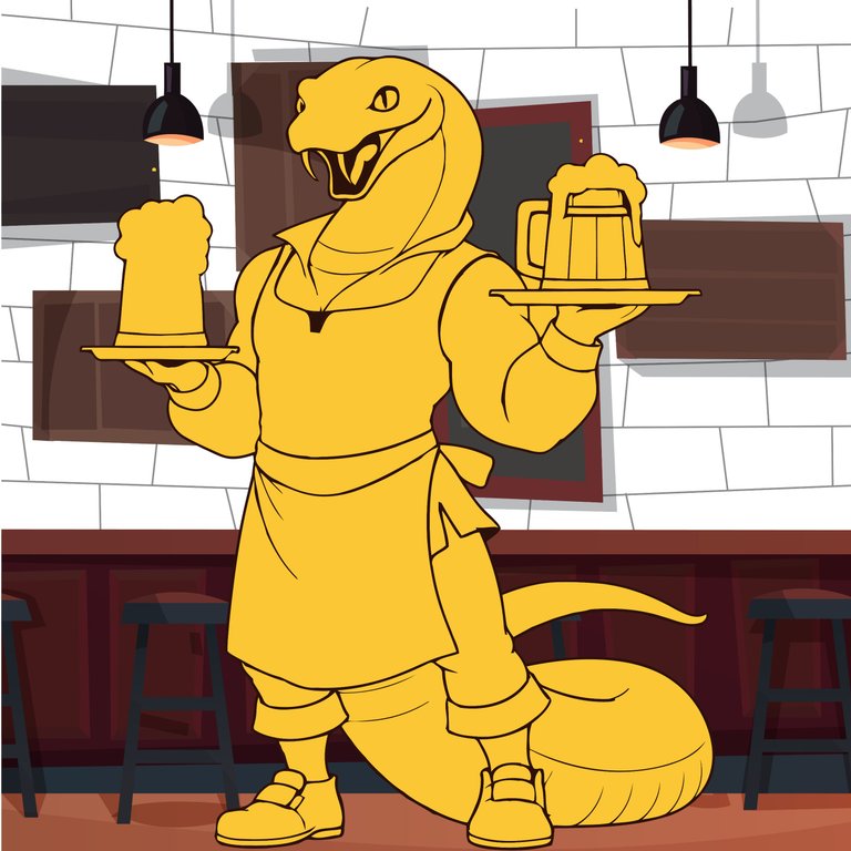
After that, the main character work begins. No need to paint it separately. I painted the character to match the background. Because if you don't do that, the bonding between them will not be created. Most of the pieces are decorated in brown colors with a hint of yellow to match the original card art.
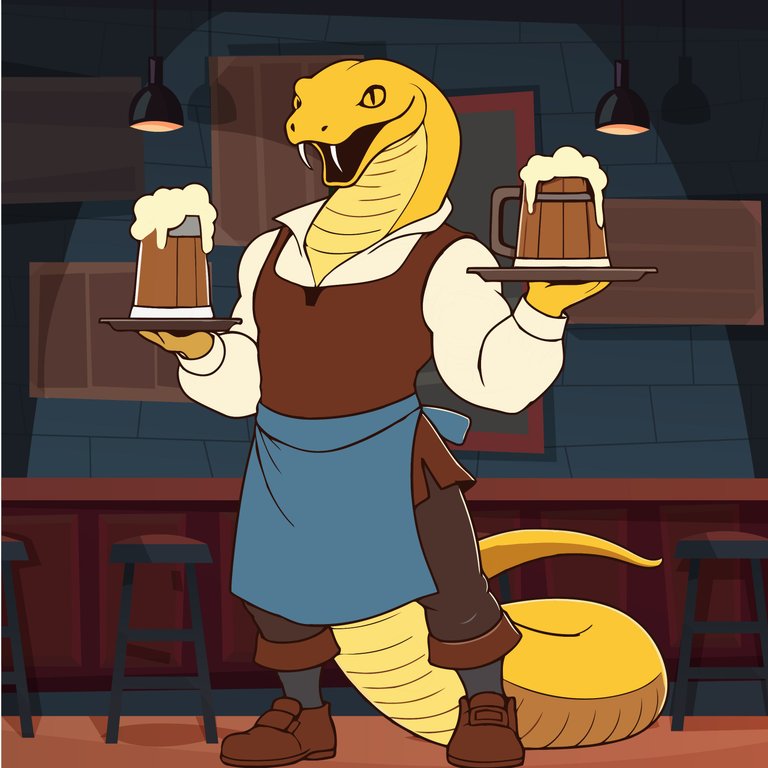
Apart from these some more color shades have been used so that the art looks beautiful. Now I have given pictures of several steps so that you can understand how I did it. Yes, it is not possible to provide all the pictures. But I try to give the main steps. Let me know how you like it. And if you have any opinion on how to make it more beautiful then let me know. thank you

