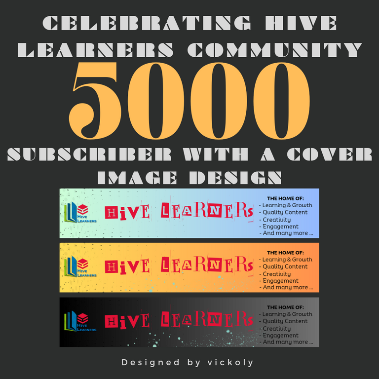
It's with great joy that I join the Hive Learners community to celebrate the remarkable milestone of 5000 subscribers in the community. Hive Learners is one of the best communities and the number one go-to place when you're in search of top-quality content on the hive blockchain, and to celebrate this milestone, I'll love to share a mind-blowing cover photo I designed in participation with the ongoing contest to mark this feast.
I've been a verified member of the community for over a year and a few months, and I can say without a doubt that the community has been instrumental in making me a better writer and in brooding out the best version of me. Looking back to before I joined the community, my writing wasn't as good as it is now, so the community is one that focuses on growth, learning, creativity, and interaction between its subscribers.
Without further ado, come along as I walk you through the step-by-step process of how I made these cover images for the community.
APPLICATION USED: CANVA MOBILE

MAKING PROCESSES
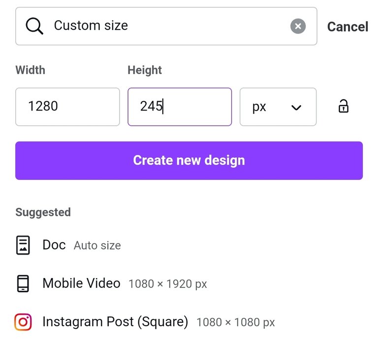
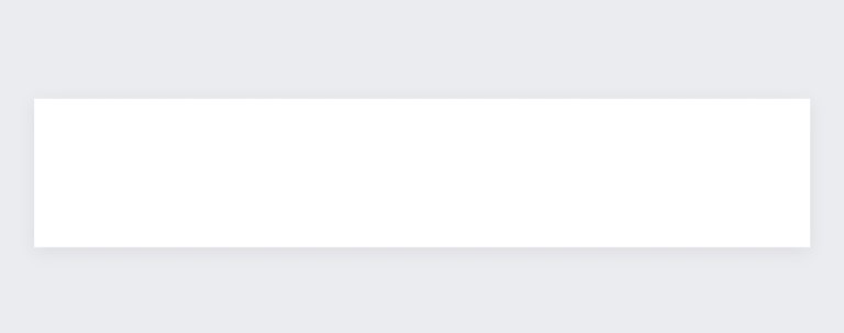
SHAPES/DIMENSION: The stipulated dimension request for this cover image is 1280 × 245, so after choosing a free template, I chose the size feature and inputted the stated 1280 × 245. The photos below show how this is done.
| Dimension Setting | Required Dimension |
|---|---|
 |  |
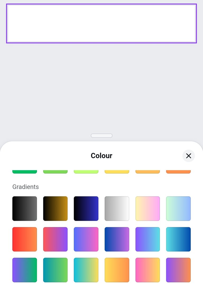
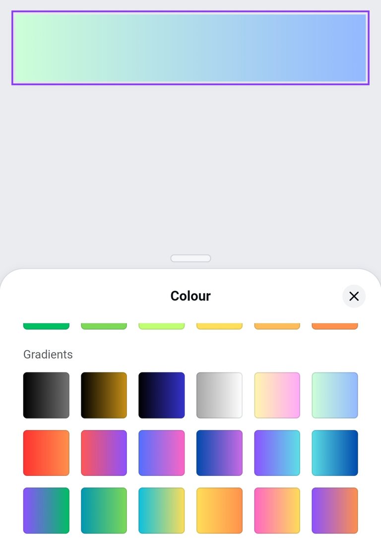
BACKGROUND COLOUR: For the colour, I wanted something catchy with a touch of gradient, so I chose from the advanced colour segment, and this light blue with a touch of green seems to suit what I wanted perfectly. The photos below show how I changed the background colour.
| Searching for Colour | Chose Colour |
|---|---|
 |  |
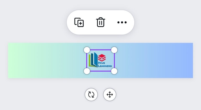
INPUTTING LOGO: After choosing my desired color for the background, I introduced the community logo into the cover photo and justified it to the left.
| Input Logo | Justify to Left |
|---|---|
 |  |
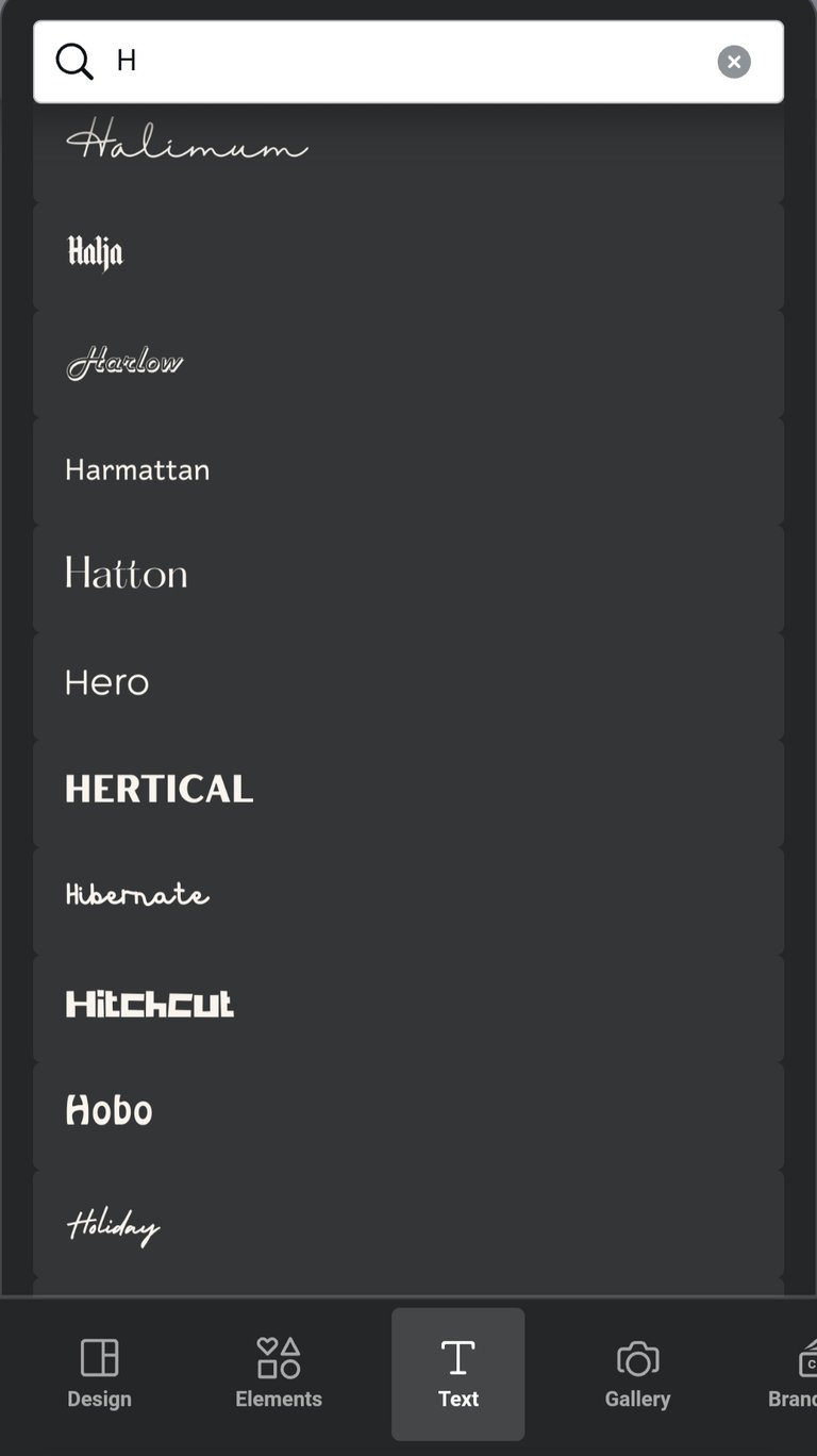
INTRODUCING TEXT: For the text, I want something that isn't just outstanding but also attractive, and instead of searching endlessly in the font section, I decided to go to the text feature and search for a letter to see the suggestions it'd bring, and among them was the one I used in this cover photo.
| Text Hunting | Text |
|---|---|
 | 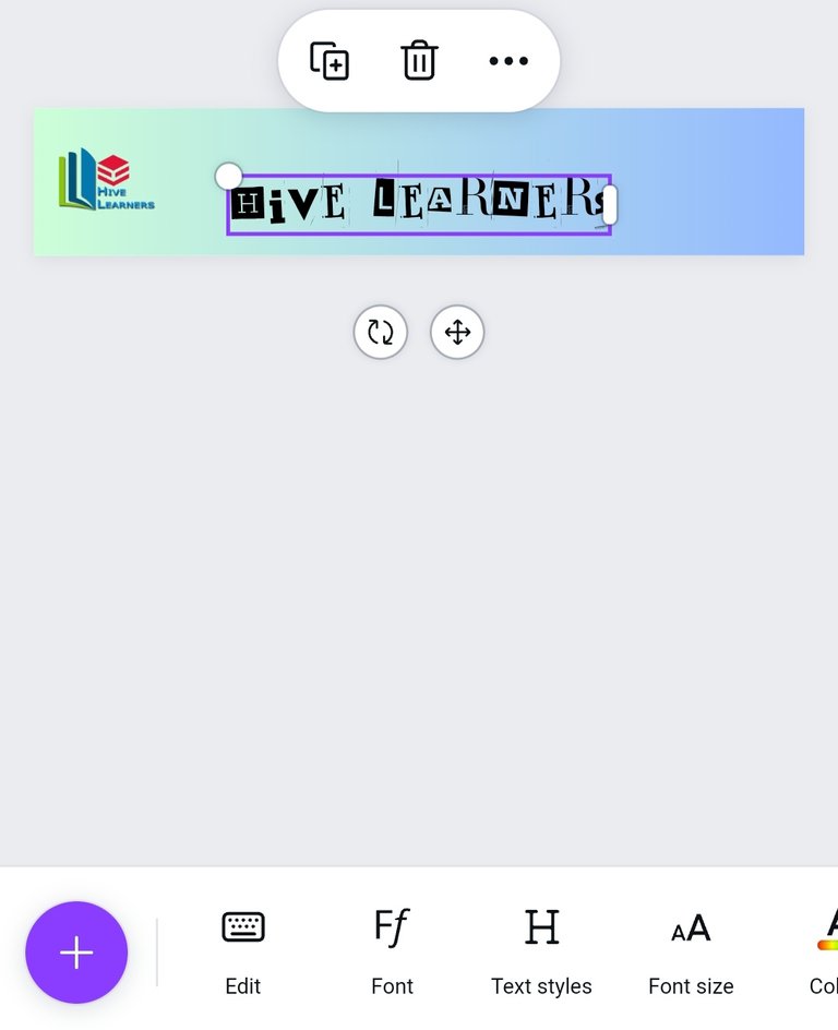 |
| More Text | Change Colour |
|---|---|
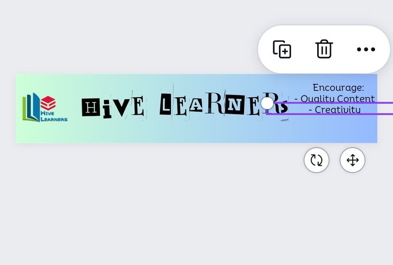 | 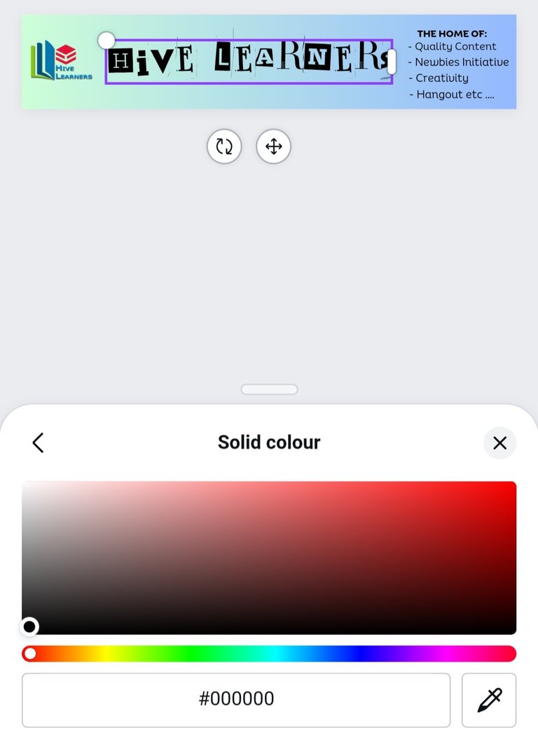 |
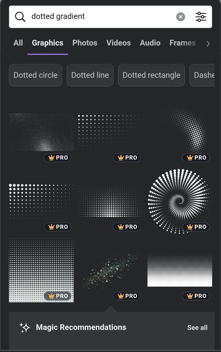
MORE DESIGNS: I was already done with the design, but I wanted to add more design to make the cover photo look cute, so I chose some dotted gradients, which I placed in some strategic places on the design.
FINAL RESULT WITHOUT GRADIENT


FINAL RESULTS WITH GRADIENT


LESS COMPLEX VARIATIONS


That's about all on my cover design created in participation with the Hive Learners community contest. The community has the right to use any of the above-listed cover photos as they deem fit.
Thanks so much for your time, I hope you enjoy the guide, have a wonderful day ahead.

