PART A
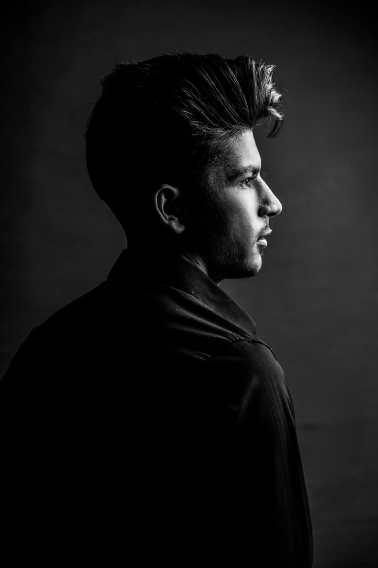
I took this photos at last night.
In this photoshoot, I took subject-oriented photos with different lighting.
From the beginning of photography, we decided that the output of our work would be black and white. Therefore, we focused more on light shadow poses.
Her face and hair were modeled in such a way that it was neither too long nor too round, her angular jaw made the lights sit very well on her face and we got a better result.
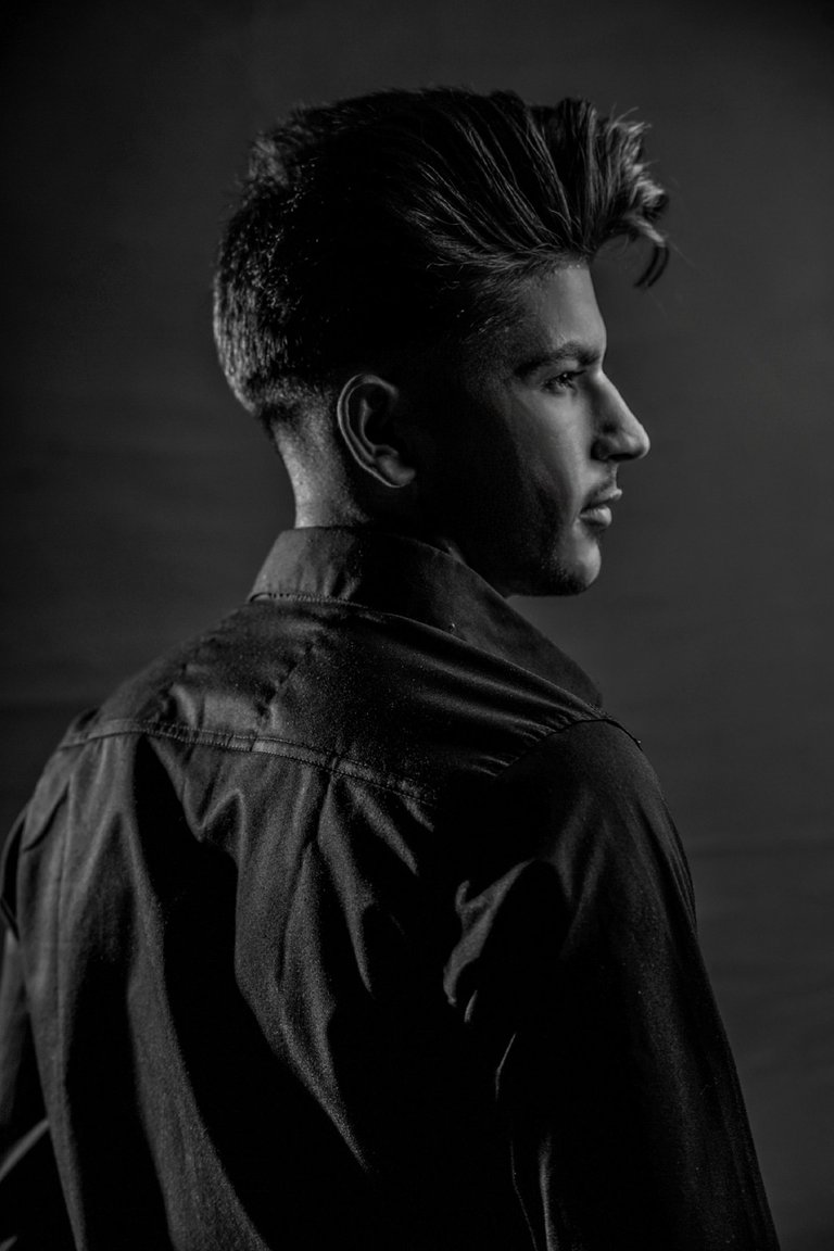
I took the first, second and third photos with one lighting. The difference is that I didn't put a light and light for the head in the first picture, but I put the light in the second picture. And this can be a good comparison of the effect of presence and absence of light behind the head.
We have more of the things you are looking for.
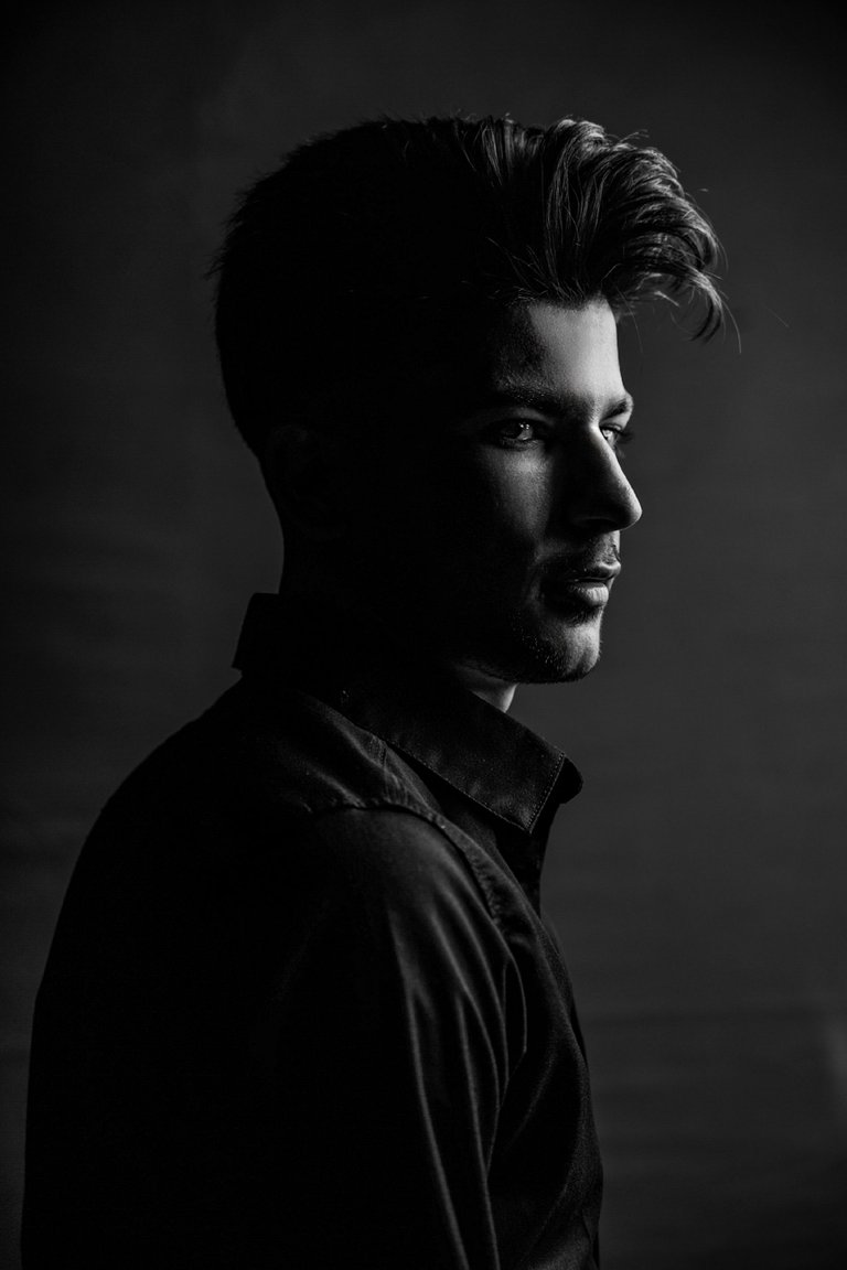
How far we make the distance of the model from the curtain behind the head, the space behind the head will also be dark.
In the style of lighting, just move the head a little to notice the different results.
Place the main light in front of the model at an angle from top to bottom
![AirBrush_20230409001224.jpg]
PART B(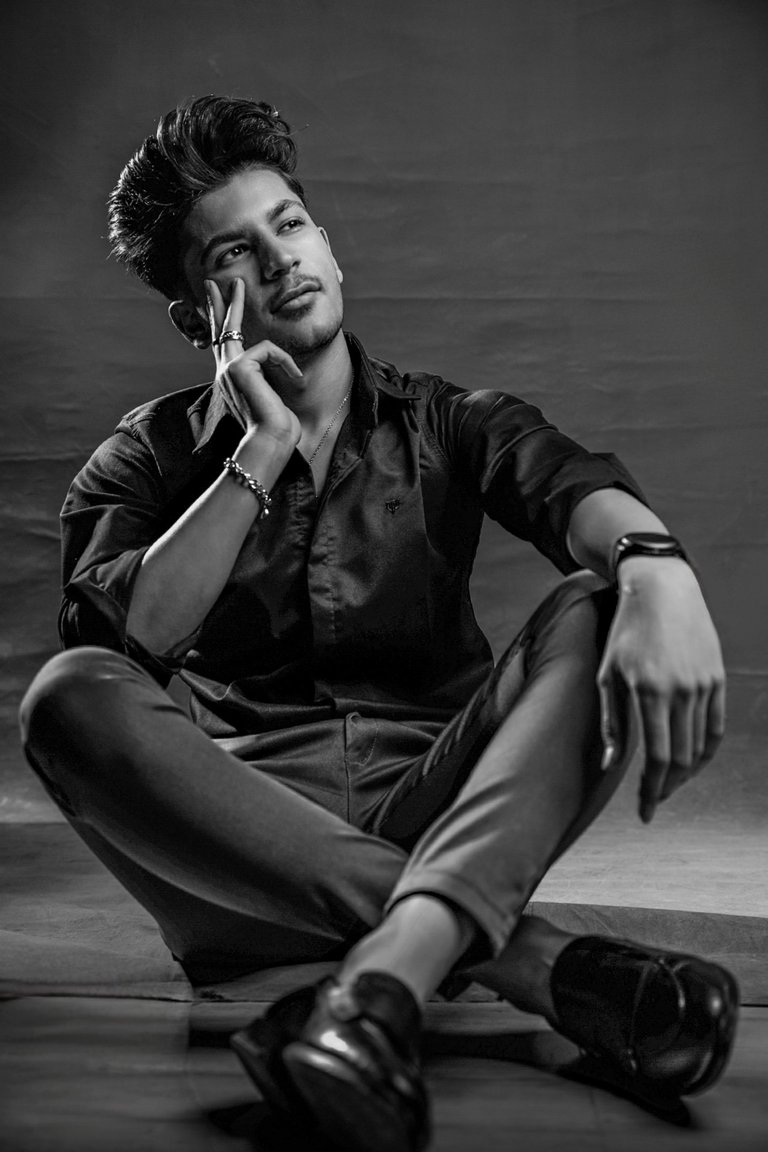 )
)
The style of the second photo is a completely different pose. There is not much about shadows in this photo and I used more than anything else on the expressions of the hands and face and a combination of the two. The photos we took were sitting.
It was a good experience for me. Most people get better at posing while sitting. How good it felt to get this model.
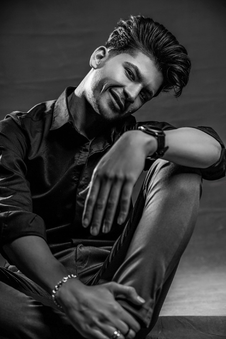
At first, we wanted to take happy pictures, but the more he laughed, the closer his face became to the laughter of the Joker movie.
Laughter is not a sign of happiness. And what a special paradox ...
The use of watches, accessories, rings, and bracelets is very important in the beauty of the medical photo, and many of them have been used, and after creating this colorless theme on it, Bitcher has already been shown.
PART C
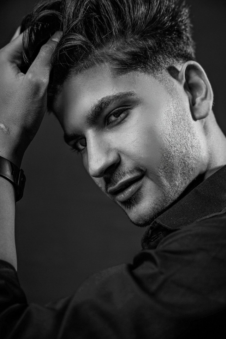
part c is a picture with vertical framing. In this photo, try to achieve a special pose with the help of hands and turning the face in 3 directions.
The only photo in which I compared the frown and the smile and found that the smile suits it better.
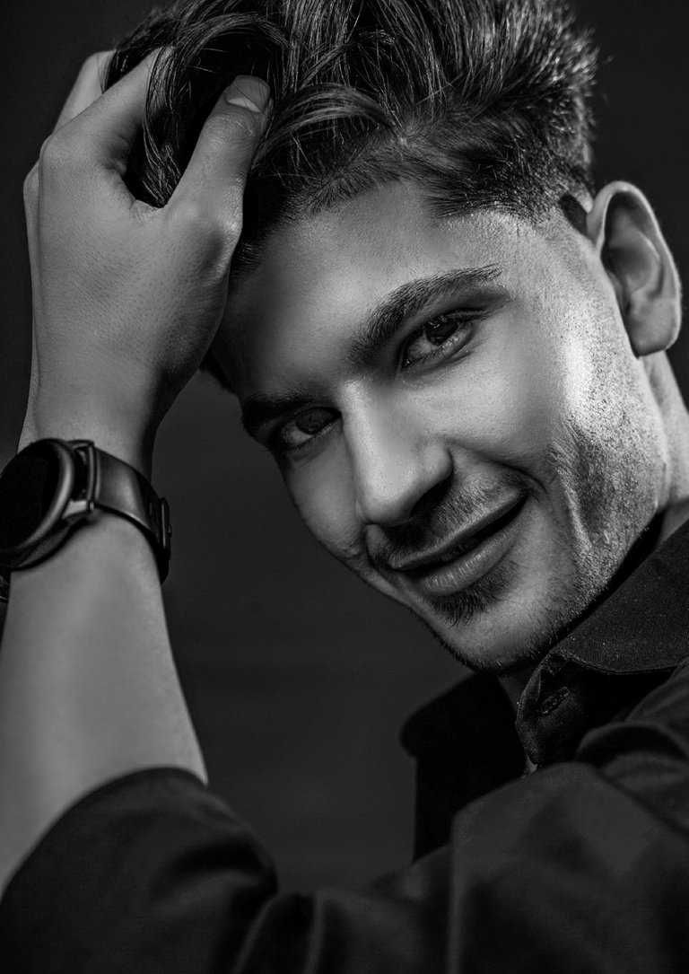
For this part I changed the light angles and put a light behind the head.
I think the light behind the head is very useful and separates it from the background very well.
BACKSTAGE
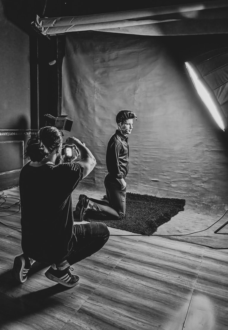
Thank you for your support until the end of the post. I would like to thank my friends in the black and white community as well as other loved ones in other communities who are always trying to make this system work properly.
As a small member, I try to contribute to the improvement of this process by following the rules and uploading my photos and videos as best qualiyy as possible.
Photography By @Menati
Camera sony a7 r 111
Lens 24-70mm f 2.8 sigma Art
