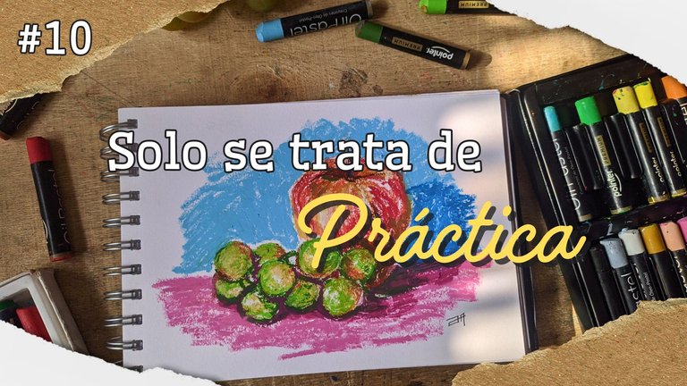
We reached the tenth day of the drawing challenge and well I can tell you that I have survived this exhausting pace, although I enjoy it, it is still hard and let's see once and for all the drawing.
Día 10: ¡Práctica!
Day 10: Practice!
Practice makes perfect is a phrase that I have heard a lot throughout my life and although I understand its meaning, it's hard to put it into practice. However, thanks to this self-imposed challenge (no one told me to torture myself this way) I have managed to be more consistent when it comes to drawing on a daily basis and really execute my knowledge in the arts.
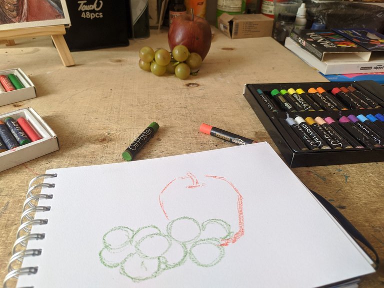
And not only in the arts I can see the result of this drawing exercise, I am also surprised to see the fluency and confidence with which I can write to you and tell you the story of my drama with this challenge.
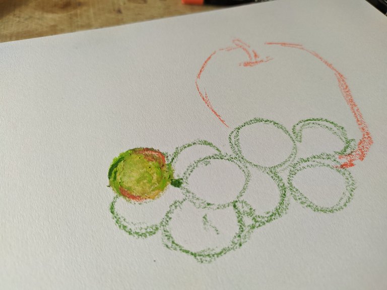
So to get down to work I took advantage of the plastic fruits that we used in class, took my crayons and began to color. The first thing was to make the sketch, in fact I did it directly with the oil pastel.
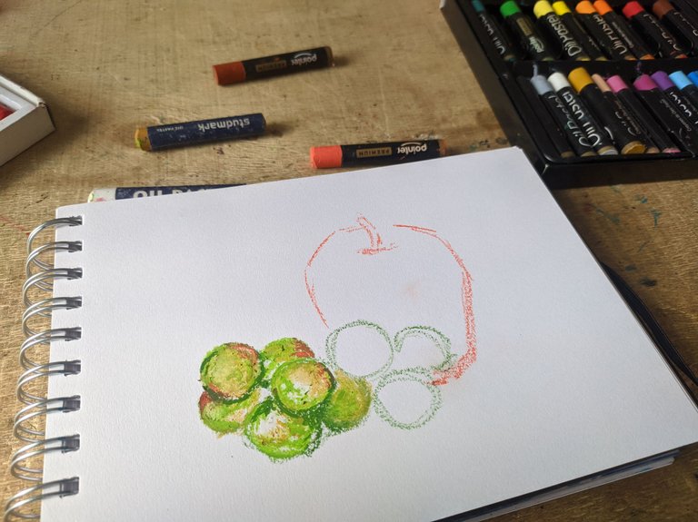
The important thing here is to observe very well the colors that are present in the objects, so I started with the grapes. These are green and at the same time they have a red color and also an ochre color and yes, I took all those colors and mixed them to give shape to each circle.
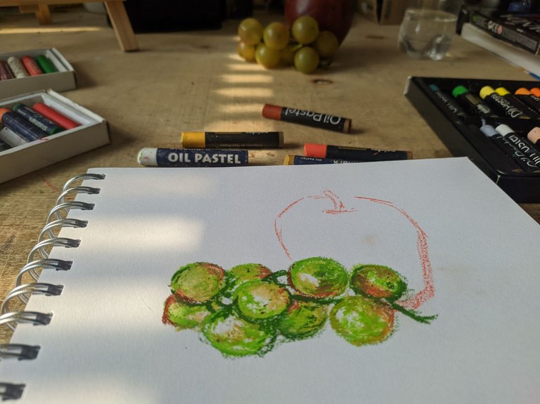
To better define the shapes I used a darker green mixed with its complementary color which is.... well I hope you know the answer.
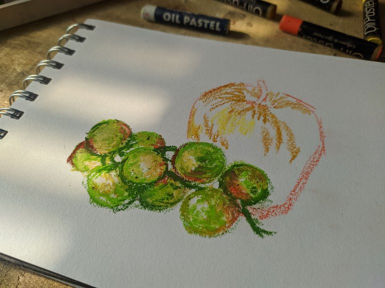
And so I went on to color the apple, starting with the lighter tones I used a pastel yellow with an ocher one, because this fruit is not super red.
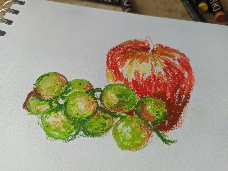
Then what followed was the addition of oranges and reds in various shades to give that sense of volume.
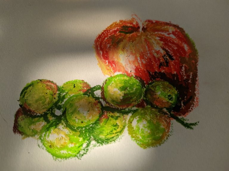
Then with an intense brown I did some details to the apple to give it more depth, oh and I also added a touch of green here and there.
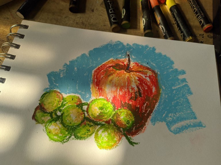
Now I took a few minutes to think about what color I would use for the background and I asked myself what colors I hadn't used so far in my drawing, the most obvious answer was blue, but what shade of blue? I chose the lightest one because it seemed to me that it combined better with the rest.
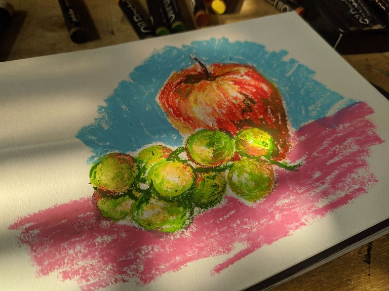
For the rest I used a pink that contrasted very well with the yellowish green of the grapes.
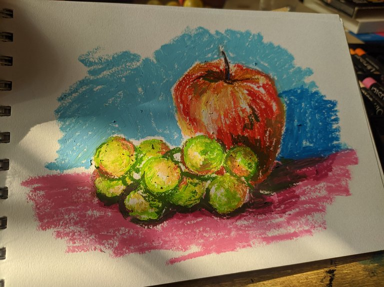
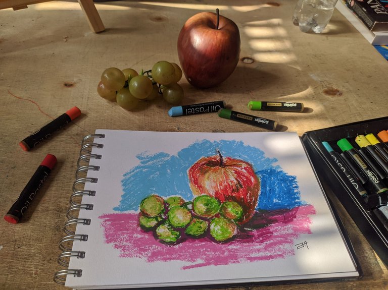
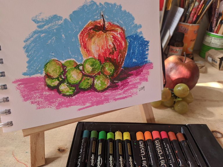
The last thing I did was to make the shadows of the environment with darker tones and that was it. I love the result with these oils that are very creamy, at some point I tried to mix them with others that I have but the textures are not the same so I ended up working only with the Pointer.
Todas las fotografías aquí expuestas son de mi autoría y fueron tomadas desde un teléfono Xiaomi Redmi note 7. La imagen de portada ha sido elaborada en Canva.
Although this practice is not as easy as you think because you need will, perseverance and a lot of perseverance to see the results of that progress you have to keep trying, so let's get down to work and keep drawing.
All the photographs shown here are of my authorship and were taken from a Xiaomi Redmi note 7 phone. The cover image was created in Canva.

A seguir practicando, chao.
Keep practicing, bye.
Posted Using InLeo Alpha
