Hello, good afternoon friends and fellow graphic designers. So after being invited to this contest by my friend @icon-bassey I was excited and thought of giving it a try. So here is me sharing my steps of designing the logo I hope @raknarok loves it. Am still a novice in the world of graphics design hehe. It took me hours to come up with this.
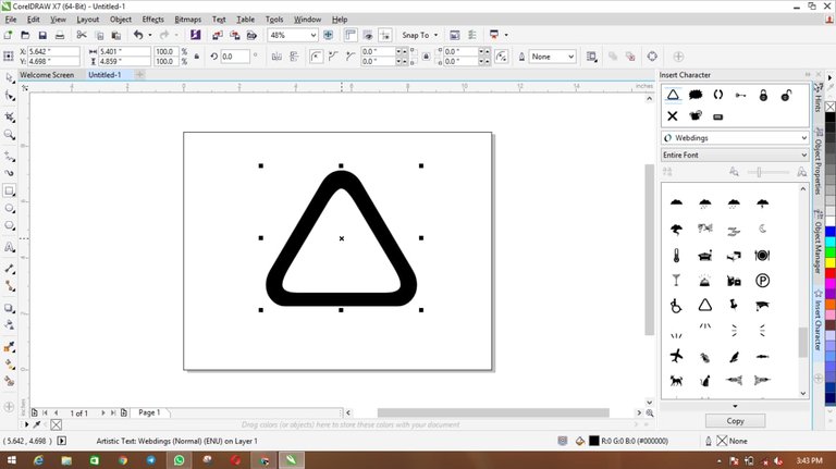
So for start, I used webddings to get that triangle. Less I forget I used the latest Corel x7 for this design.
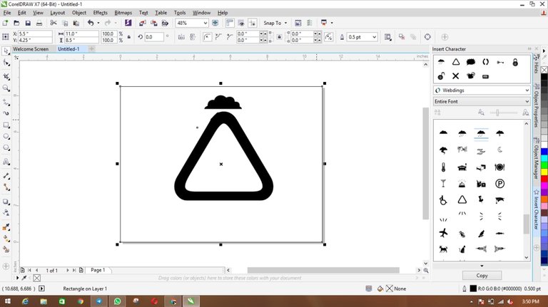
Even the little warrior sitting on top of the triangle I got from webddings, you could see on the right side of the screen. I wanted to use the other object in form of clouds but later had to change to the little man. As it will be more interesting having that little warrior on top of the triangle hehe.
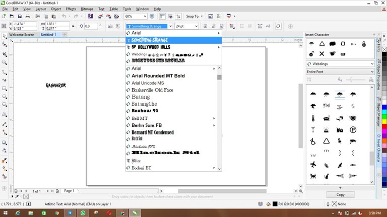
For the fonts I used "something strange" then the big R inside the triangle I used fonts named "Rosewood std regular" then I increased the font size to the highest.
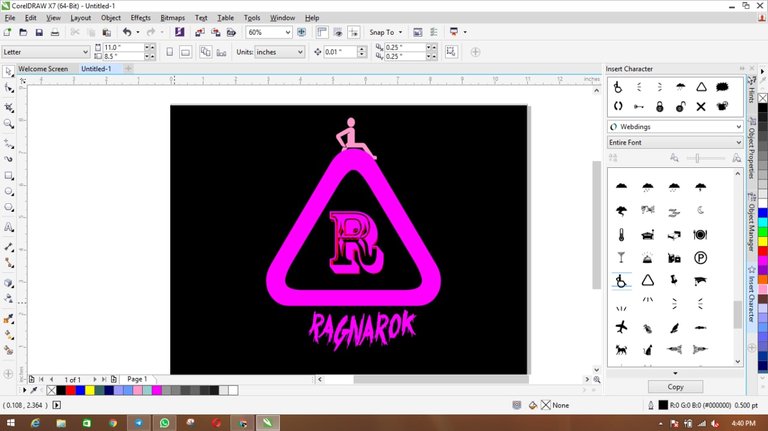
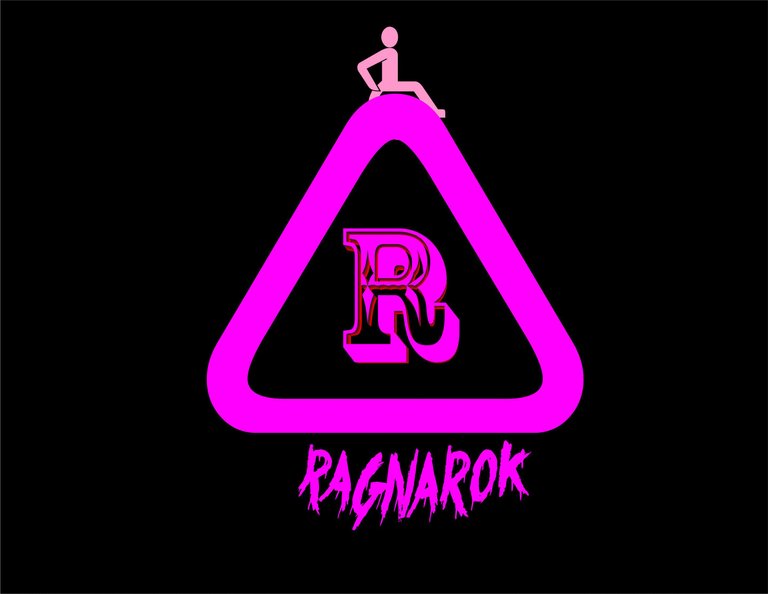
The last thing was to insert colors which were quite difficult but I ended up with black background and MAGENTA for the triangle and the fonts.

Happy weekend guys!! TGIF🙌💃
